The quarterly snapshots from ACECQA tend not to serve up many surprises these days and while the most recent report is no exception, there are still some gems to be found that keep your knowledge of the sector up to date. Read on for a selection of data we’ve sourced from ACECQA’s smart new Online Snapshot service or head here to download the PDF report.
It’s August 2019 and the ACECQA media release once more leads with the news that, ‘Almost eight out of 10 services have an overall quality rating of Meeting NQS or above’.
Meanwhile the tabloids and regional daily papers take the same number and scream, ‘One in five daycares fail quality test!’
It’s hard to believe they’ve read the same report, but all depends on where you are when you look at it.
So it’s another quarter, another NQF Snapshot. What can we learn this time?
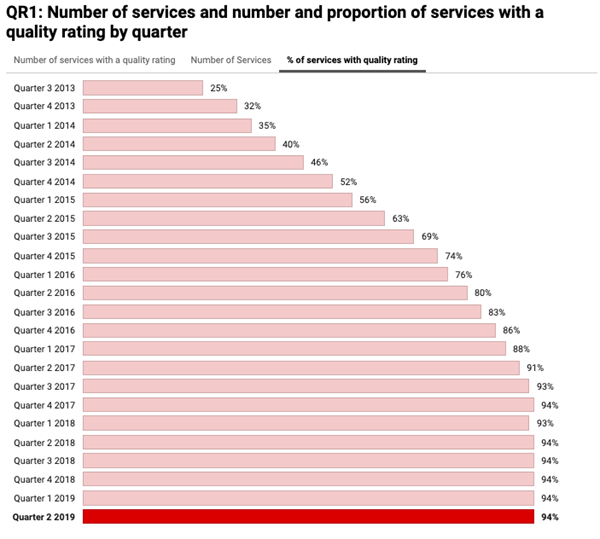
Topped out at 94%
While there may have been hopes it would creep higher, it looks likely the maximum percentage of services that will hold a rating nationally is stuck firm at 94% under current conditions.
The proportion of rated services was never going to reach 100% as new services will continue to open and regulatory authorities (RAs) may choose not to assess a service that’s less than 12 months old. There are some other circumstances at play too, in which a provider might legitimately request a delay in initial assessment, or in which an RA does not have the resources to keep pace with new providers in fast-growing areas.
This is what the total percentage of rated services looks like over time (note, all graphs are sourced from ACECQA’s Online Snapshot dated August 2019):

The percentage of services rated was once a key indicator of the NQF’s implementation, but after five consecutive quarters at 94% it does appear to now be in maintenance mode.
Ups and downs
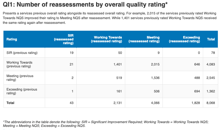
One of the more telling charts from ACECQA’s Snapshots is the one showing the outcome of a service’s ‘reassessment’. That is, the movements between services’ previous ratings and their most recent assessment.
If you’re not a data buff, this chart can require a bit of extra concentration, because it moves in both directions. Focus carefully for a couple of minutes though, and it will start to speak to you more clearly.
Here’s the chart:

And, while there will be a personal and geographic tale behind each one, if we only knew it, here are some of the data stories the chart has to tell:
- 19 services that were previously assessed ‘Significant Improvement Required’ (SIR) had not improved enough by their next assessment to change that rating.
- Nine services that were formerly SIR have improved so much they leaped forward to a full Meeting rating on their next assessment.
- One service previously rated Exceeding has plunged to SIR.
- A greater number of services jumped from a Working Towards rating directly up to an Exceeding rating than the number that lifted one level from Meeting to Exceeding.
Quality questions
Qualitative measurement, like the NQF’s assessment and ratings process, is always open to interpretation, manipulation and criticism. Any group of directors brought together will be able to share vastly different experiences of each A&R visit they’ve experienced based on their location, service type, provider support, staff readiness, and – a favourite theme – the personal and professional approach of their assessor.
So when we look at overall quality ratings, we will never get the whole picture according to an individual service.
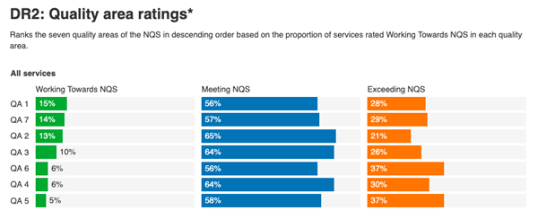
Here is the most recent national state of ratings outcomes in the seven Quality Areas (2018 versions).

Attention is often focused on poor old QA1, Educational Program and Practice. It’s up there in the top left corner with, yet again, the highest low outcome of any Quality Area. It’s been one of the hardest QAs to crack since the beginning of the NQF and has been linked to the long way the sector still has to go in improving its overall pedagogical capacity with qualified and well-supported educators.
But let’s not ignore QA2, Children’s Health and Safety, with almost as great a proportion of Working Towards outcomes and, to look at this chart another way, the lowest appearance of the highest rating.
It’s elementary
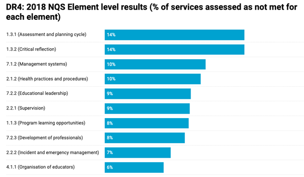
Our final data story this quarter is also drawn from the quality ratings outcomes. We’re looking at the top 10 unmet (Working Towards) outcomes in this report.
Here is the chart:

As you’ll know if you’re in a service and have received your assessment, the devil is often in the detail and it’s down to the elements you must go!
One observation of this chart is that, on a per element basis, it very quickly falls to single figures at the Working Towards level. By the time we get to the 10th ‘worst’ outcome, only 6% of services are on the lowest rating. That alone speaks well of the NQF’s overall implementation and progress towards quality.
Another observation is that the top three ‘worst’ are heavily based in areas where leaders can be better supported and where there’s a clear benefit for investment in quality professional development programs.
This is a sector with high staff turnover and high maternity leave rates, where many people rise more quickly to positions as directors and other leadership roles than they would in another professional field.
There is enormous potential, still, to better support and engage with those leaders – younger or more mature, experienced and new – and equip them with exactly the skills to target those less successful quality elements.
Over to you
What stories do you want to hear about from these NQF Snapshots?
Related articles
About The Author

Bec Lloyd is the founder and managing director of Bec & Call Communication, providing professional writing, editing and strategy services to the school and early childhood education sector since 2014. In 2018 she launched UnYucky mindset and menus for happier family mealtimes. Formerly the communications lead at ACECQA and BOS (now NESA), Bec is a journo and mother of three who produces Amplify for us at Community Early Learning Australia.